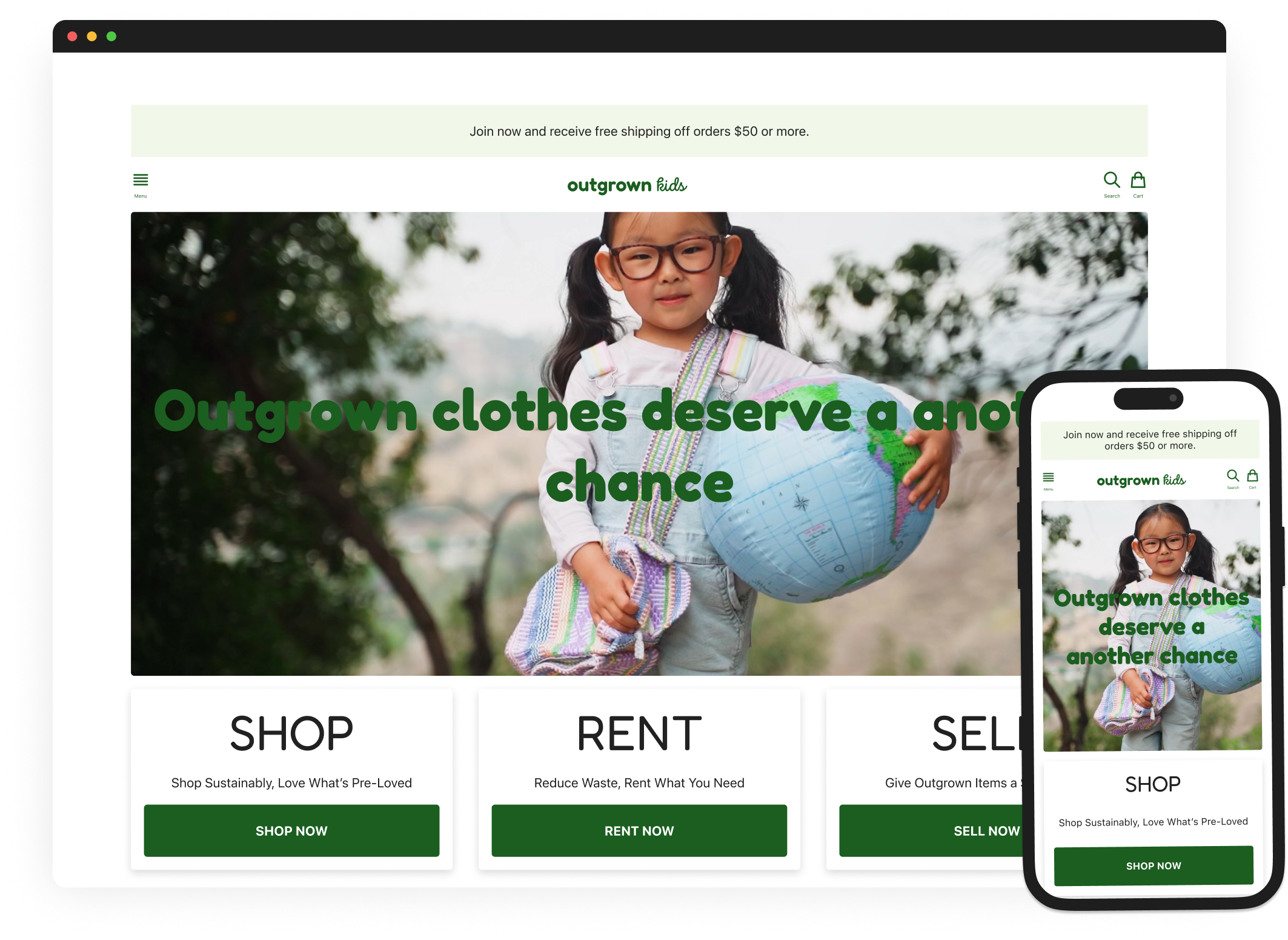
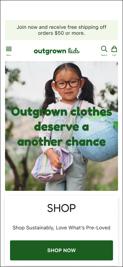
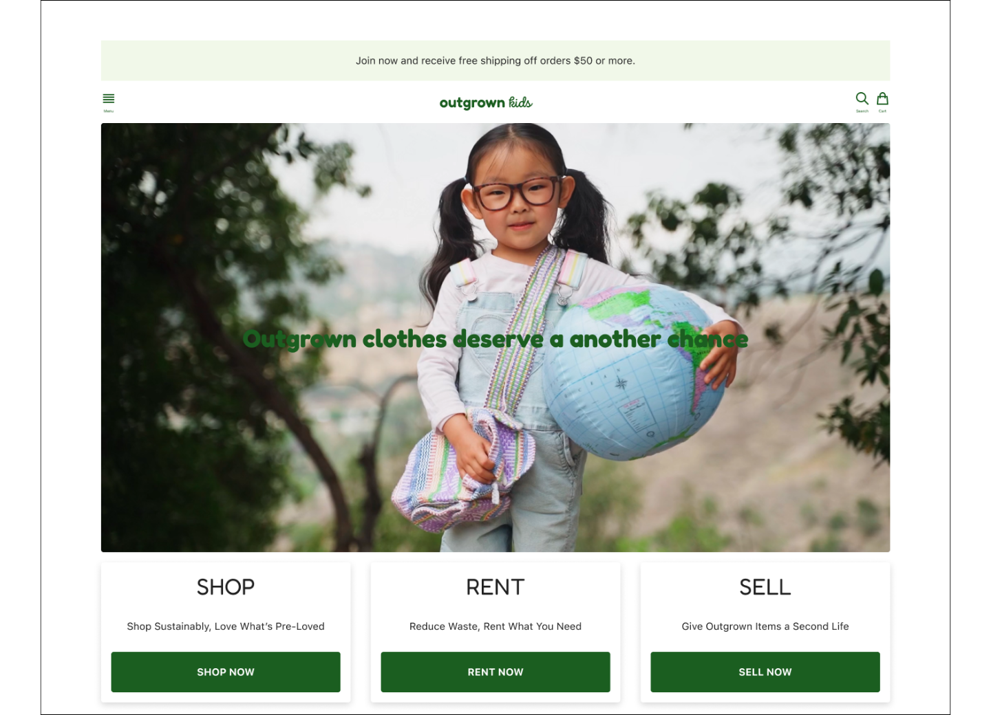
Outgrown Kids
Outgrown Kids is a responsive web app designed to help parents and caregivers conveniently buy, sell, and rent gently used children’s clothing.
Project Overview
Product
Responsive Web App
Project Duration
8 weeks, November 2024 - January 2025

My Role
UX Design | UX Research | UI Design

Responsibilities
User Research | Usability Testing | Wireframes | Prototypes | Mockups
Parents often face clutter and high costs from outgrown children's items, making it difficult to sell or replace them affordably while supporting sustainability.

The Problem
The project aimed to design an intuitive platform that makes buying, selling, and renting children's items easy and enjoyable, helping parents save time and money while promoting sustainability.

The Goal
Understanding the user
User research
Personas
Problem statements
User journey maps
User Research Summary
To better understand user frustration, needs, and requirements, foundational research was conducted through interviews and user surveys. The goal was to gain insights to better understand the processes that users go through to manage outgrown clothing items.
Of the two types of user research methodologies, qualitative and quantitative, qualitative was chosen due to time constraints.
User Research Pain Points

Clutter from outgrown items
Parents needed an easy way to declutter. Designs focus on simplifying item listing with minimal steps.

Finding affordable replacements
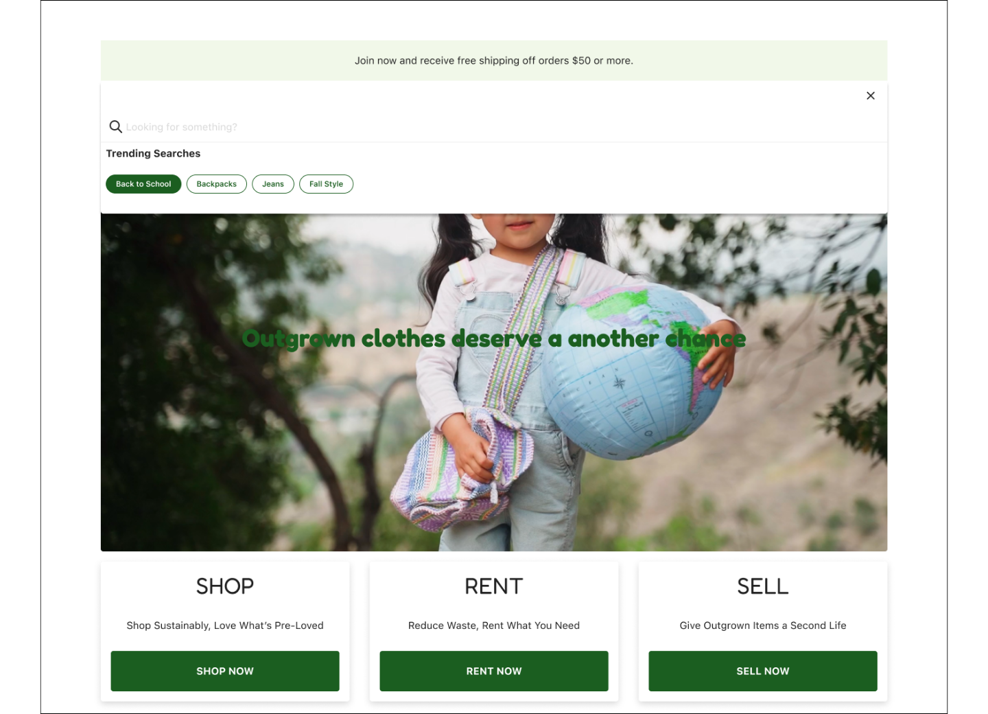
Affordable, quality items were hard to locate. Search filters and recommendations became key design priorities.

Safety and quality concerns
Users worried about item conditions as they shopped. Features like detailed descriptions, photos, and ratings ensure transparency.

Trust in online exchanges
Users hesitated to transact with strangers. Secure payments and messaging systems were added to build trust.
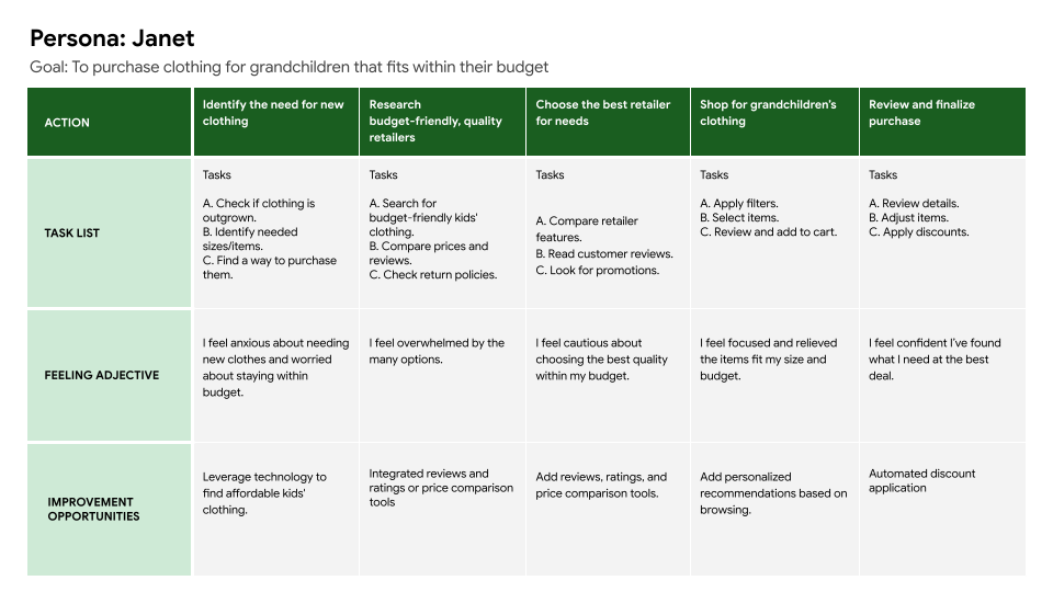
User Persona
Problem Statement:
Janet, a retired teacher with arthritis, needs a secure, easy-to-use platform to manage her grandchildren’s clothing due to her physical limitations and fixed income.

User Journey Map
User journey maps were created to illustrate the processes that users like Janet might go through while trying to accomplish their goals, including how they might behave, feel, and their thoughts while completing goal related tasks. The goal of these user journey maps was to address pain points or take note of any moments of enjoyment.
Starting the design
Paper wireframes
Digital wireframes
Low-fidelity prototype
Usability studies
Sitemap
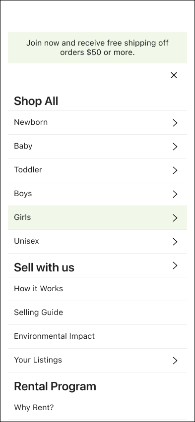
The sitemap was designed to make navigating the platform simple and stress-free, helping users easily browse, sell, and manage their items. The focus was on keeping things straightforward so users can quickly find what they need without feeling overwhelmed.
By organizing everything into clear categories and creating direct paths to key features, the sitemap reflects the platform’s goal of being efficient, user-friendly, and aligned with sustainable practices.

Paper Wireframes
Paper wireframes focused on on the core features identified during user research. The first wireframes were created using pen and paper.
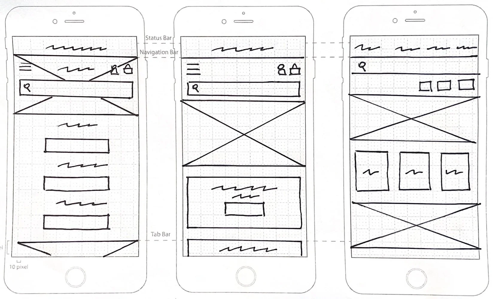
Paper Wireframes (Screen Size Variations)
Paper wireframes for screen size variations were designed to ensure that the web application would be fully responsive and would adapt across devices. A mobile-first approach prioritized touch-friendly elements for smaller screens and scalable components for larger ones.
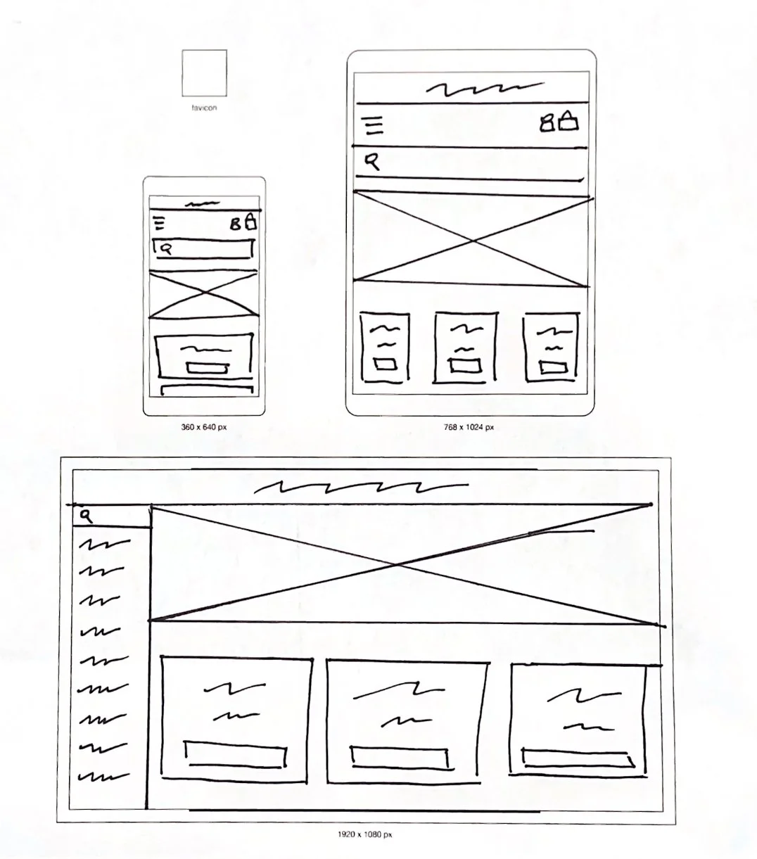
Digital Wireframes
Digital wireframes were created based on the best low-fidelity wireframes. These user-friendly wireframes would provide clear navigation and quick access to key features, streamlining workflows for busy parents and caregivers.
Before creating a low-fidelity prototype, a peer review was conducted. Feedback from this review improved usability with icon labels, collapsible search and filters, and larger buttons for a better user experience.

Digital Wireframes (Screen Size Variations)
The goal was to create responsive layouts with clear navigation and usability. A mobile-first approach used drop-down menus for smaller screens and tab-style menus for larger screens. Peer feedback improved accessibility with collapsible filters and larger buttons.

Low-Fidelity Wireframes Peer Review Findings
Before moving forward with testing the low-fidelity prototype, a quick peer review of the design was conducted. Feedback included a need for improved usability with icon labels, collapsible search options, as well as increased button size. These findings were addressed through quick iterations of the design.
Larger touch friendly buttons were incorporated to improve usability and to speed up the actions of users.

Larger Buttons
An expandable search bar was added to save space on the home page while keeping search actions accessible.

Collapsible Search
Text labels were added to clarify icon functions to reduce confusion and improve navigation for users.

Icon Labels

Low-fidelity Prototype
The low-fidelity prototype shows the user landing on the homepage and browsing for an item. They select the item they would like, add it to their cart and proceed to the checkout process to complete their purchase.
Usability Study Parameters
Findings showed users appreciated the ease of use of the design but faced challenges with specific features across devices.
Study Type
Moderated and unmoderated
Participants
5 participants

Length
20 -30 minutes

Location
San Francisco, CA and Remote, USA
Usability Study Findings
Findings showed users appreciated the ease of use of the design but faced challenges with specific features across devices.
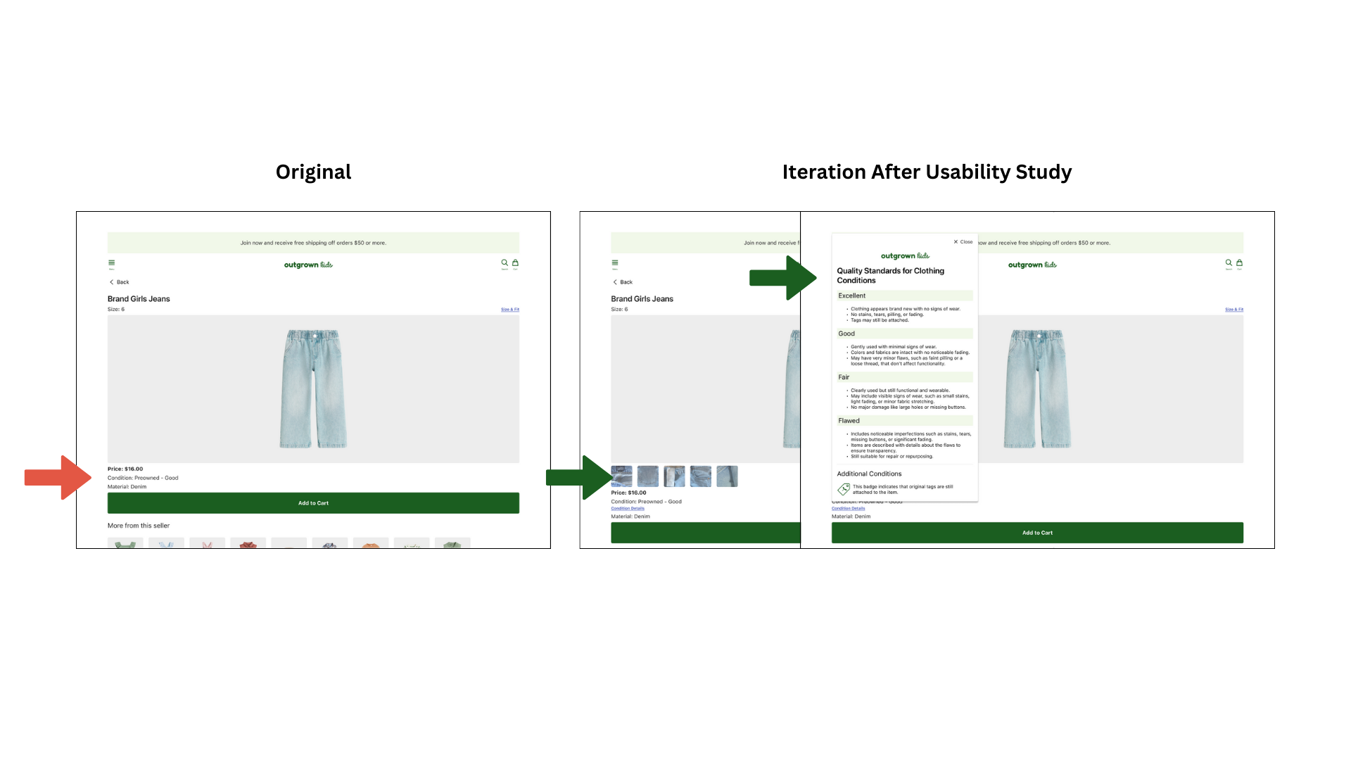
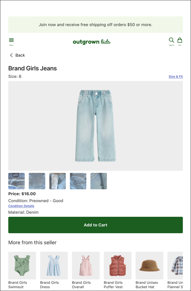
Boosting Confidence with Quality Indicators
Users desired more quality indicators, such as detailed condition descriptions, photos, or videos showing all angles of the item
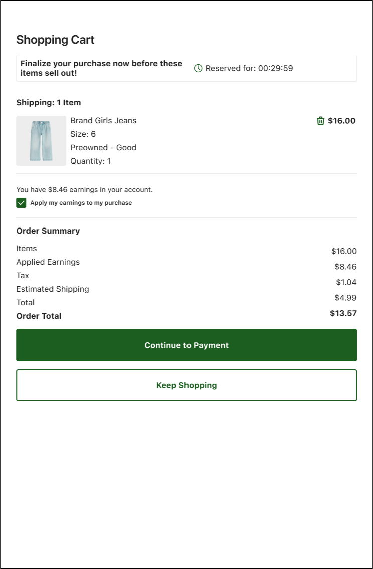
Users reported frustration with the inability to apply their earned cash toward purchases at checkout.
No Option to Apply Earnings
Parents worried about item condition. Features like detailed descriptions, photos, and ratings ensure transparency.
Limited Search Filters
Refining the design
Mockups
High-fidelity prototype
Accessibility
Mockups Addressing Feedback
Participants wanted more advanced options, such as filtering by brand and price ranges.
Limited Search Filters

Mockups Addressing Feedback
Users reported frustration with the inability to apply their earned cash toward purchases at checkout.
No Option to Apply Earnings
Mockups: Addressing Feedback
Boosting Confidence with Quality Indicators
Users desired more quality indicators, such as detailed condition descriptions, photos, or videos showing all angles of the item
Mockups Mobile


Mockups Tablet

Mockups Desktop


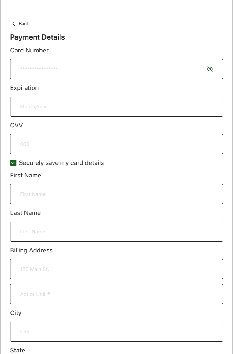
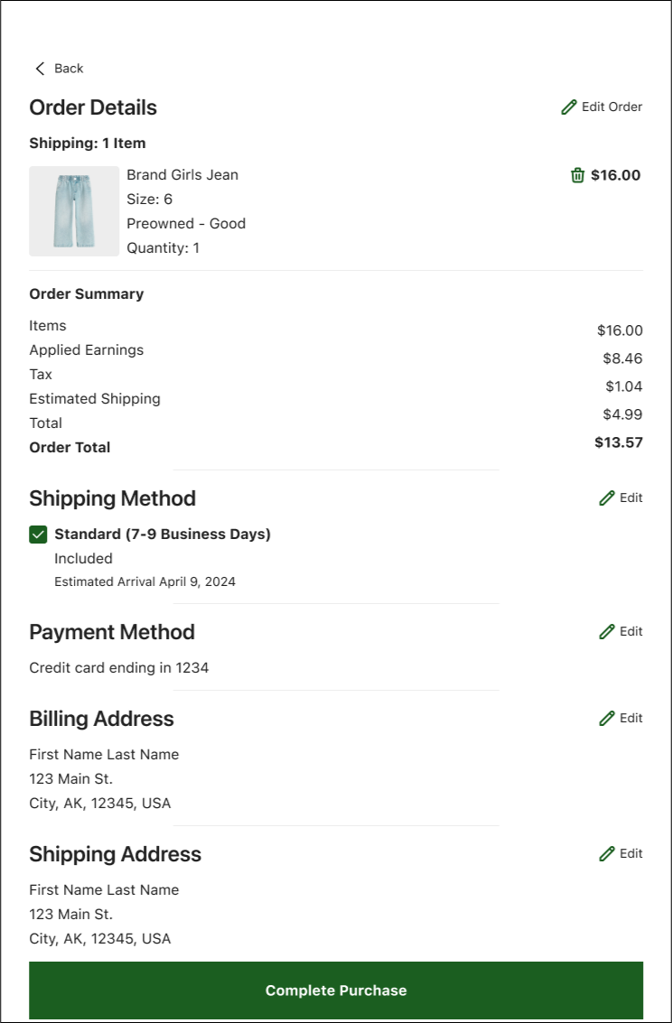
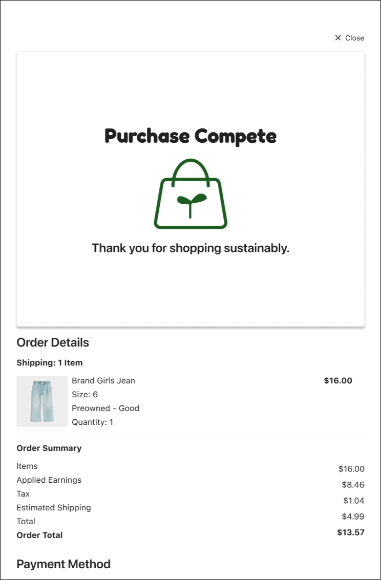
High-fidelity prototype
The high-fidelity prototype highlights the purchasing flow, featuring improved filtering, earnings application, and secure payment options based on feedback from usability testing.
Accessibility considerations
The designs use consistent font sizes, spacing, and color to ensure all text and elements are easy to read, meeting WCAG guidelines for accessibility.
Clear Visual Hierarchy
Target Size, Spacing, & Visual Cues
All interactive elements, such as buttons are designed to ensure ease of use. They are distinct with adequate contrast to help users with motor or visual impairments easily identity and interact with them.

All text meets recommendations by WCAG for contrast ratios to help users with visual impairments to view content more easily.
Contrast Ratios
Going forward
Takeaways
Next steps
Takeaways
The designs simplified the process of managing outgrown items, emphasizing convenience and sustainability. A peer shared, “The layout is so clean and straightforward—it makes everything from browsing feel effortless!”
Impact
This project taught me the importance of aligning designs with user needs and feedback. I gained insights into improving usability with clear navigation, trust indicators, and accessibility while ensuring responsiveness across devices. It reinforced the value of iteration and collaboration in creating user-centered designs.

What I learned
Next Steps
Expand the prototype to include flows like selling, renting, managing earnings, and tracking shipments to showcase the app’s usability and sustainability while enhancing my ability to design complex, interconnected systems.
Test the high-fidelity prototype with expanded user flows with a broader group of users to validate design improvements and uncover any remaining pain points and help to sharpen my ability to gather and analyze user feedback to hone in on my skills in creating user centered design.
Share this case study and prototype with peers and mentors for constructive feedback so that I can further refine designs and help to grow my experience in design collaboration.
Let’s connect!

Feel free to contact me to discuss this project or review more of my work.